

I have been thinking about how we describe colour. This was prompted by my quest to find the perfect blue for a cardigan I want to knit. Perfect for me, not perfect perfect. I find it all utterly confusing. Look at the colour palettes of the Cascade yarns for example here. These are some of the blues listed:
midnight - summer sky - cobalt - sapphire - Westpoint blue - smoke blue - spectrum blue - Como blue - blue velvet - hyacinth - denim - blue - Carribean - blueberry - aporto - navy - Puget sound - skylight blue - in the navy - blue horizon - baby denim - colonial blue - cerulean - mallard
So many questions come to mind. How many blues does one possibly need? The abundance does not make for easy decisions.
Who decides how to name the shades of yarn? There appear to be common names, for example navy blue, a colour that is well known and most of us can picture this shade of blue. But other names seem to be pulled out of a hat, for example 'Mäuseballett auf der Wiese' (mouse ballet on the meadow), a Wollmeise yarn. Guess the colour of that one before you click on the link!
Going back to the blues above. What blue is the summer sky? What part of summer and what time of day does it refer to, and above which lands are we gazing into the sky? Would it be the same place where we also spot the midnight sky?
And what about denim? None of my denim jeans are the same shade of blue. Unwashed denim is a proper dark blue, almost navy more blue (if that makes any sense), the Cascade shade shown is much lighter, maybe that of a pair of my jeans worn and washed weekly for a year? Was it an arbitrary decision or was the yarn colour decided upon in a time when dark jeans were not fashionable?
What is the difference between navy and in the navy blue? It must be a linguistic finesse that I can't crack.
What about cerulean? I like the sound of that one. Before I looked it up, I thought this colour name reminds me of whales but I got muddled up with cetacean, which is the order name to describe whales, dolphins and porpoises.
This is what Wikipedia has to say: 'cerulean, also spelled caerulean, is a color term that may be applied to certain colors with the hue ranging roughly between blue and cyan, overlapping with both. It also largely overlaps with azure and sky blue, although cerulean is dimmer.' I am none the wiser. The word cerulean derives from caeruleus, which is Latin for dark blue, or blue green, and this probably derives from caelulum, a diminutive of the latin word for sky and heaven, caelum. A sky blue then? Would the cerulean blue refer to a different sky blue than the one above?
Apparently Pantone crowned cerulean the colour of the year 2000. The code is #15-4020. I looks quite different from the cerulean the Cascade yarns dye master creates. Less white in the blue I guess. I prefer the latter.
 | |||
| Pantone cerulean |
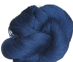 |
| Cascade Heritage yarn in cerulean |
I like the Pantone matching system, it gives colours a number with guidelines how to create them for print and even fabric, or the RGB colour charts for screen colour and printing. There must be other ones, too. I like a bit of certainty. Do you like the Dulux paint shade cards? I do have a soft spot for those and pick a few up whenever we go to B&Q. I don't ever do anything with them. On the other hand, it would be rather weird if you wrote on a postcard 'The sky is the most beautiful shade of Pantone 15-4020 and the water in the lagoon is an amazing Pantone 15-5519. Not much use either unless you have memorised all the shades and codes.
Of course rather than pondering the naming of colours and how they came about I could just choose the colour I like most on my computer screen and hope the real thing is true to the screen thing. But I can't help myself, my mind works like that, always thinking, evaluating, and of course procrastinating. I don't make decisions easily, even inconsequential ones like the colour of my next cardigan. If you are interested, after two days of to-ing and fro-ing I chose cerulean. Now for the fibre content of the yarn..... there is luckily only two to consider!
Coincidentally, did you know that this year's Pantone colour is Marsala? Pantone 18-1438. It is a reddish brown I do not care for much.
Have a lovely Wednesday! Christina xx


0 Yorumlar